New Pepsi
Friday, October 31st, 2008So Pepsi has a new logo… looks a little like Korean Air in a can to me. I prefer Coke’s pared-down approach.
So Pepsi has a new logo… looks a little like Korean Air in a can to me. I prefer Coke’s pared-down approach.
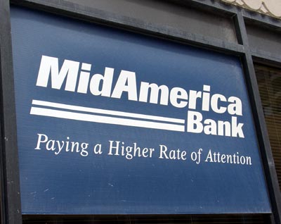
I was strolling down the street a few days ago and noticed this sign for MidAmerica Bank:

Look at that slogan: “Paying a higher rate of attention.” That made me scoff. Oh sure, I thought. How like marketing: to promise some intangible/immeasurable quality, some perceived difference. Rather than paying a higher rate of interest, which costs money, they just give empty slogans.
Except then I remembered why I like my (Chicago) bank:

(Also available in lesbian!)
Sometimes I suppose it’s just a matter of using the right slogan:
![]()
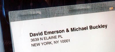
Oh, by the way, about that address:

I’m sure it won’t come as a surprise that there is no “Elaine Place” in New York City. But I wonder if there was an Elaine involved in the production of the ad… I remember a time when I was putting together some ads for a magazine, and the sample address I used was “Perkins Lane”.
You gotta leave your mark somehow…
Last year, I saw an ad using a (hairy) shirtless man to sell mortgages to gay men.
Last night, I saw this banner ad using a similar approach for het men (imagine it in Flash, with the chick dancing around):

My question: is this the most effective appeal they could create? What was the thinking: “Hey look, it’s a dancing girl in a bikini top — that’ll attract the re-fi market!”
Several months ago I wrote about what I saw as a trend towards much larger online photos, particularly on entertainment websites. I see more and more examples of this every day (e.g., compare the width of the image on Apple’s new Mac mini page as compared to the tabs bar above it) but yesterday I saw a site that took it to the next level.
For really large pictures — and big video to boot! — check out Fox’s Walk the Line DVD site (note: check your volume first.) Is this the wave of the future for movie sites?
Oh, and though I strongly support larger video, I have to roll my eyes at their use of the heretofore non-existent “HD website” label.
As I read through this month’s American Cinematographer, I couldn’t help but notice that awards season is upon us. OK, that’s actually a genteel understatement, because I was truly hit over the head with it: there were 20 “for your consideration” ads for the Oscar in cinematography. Seventeen of them were full-page, and 15 of those occurred in the first 32 pages. When every odd-numbered page at the front of the book is a full-page plea for votes, it’s difficult to miss.
This inspired an idea: why not make a weekly for Academy voters? I’m thinking of a Awards Season Weekly, published only from 1 Jan through to voting day, with each issue devoted to a major category (to allow everyone the chance to buy full-page ads.) Of course, to qualify for magazine postage it must contain a certain percentage of editorial. This could present a problem when you have no reporters and no insights. (Hmm,
Gentle reader, allow me to introduce you to the
They come from “buy magazine,” the “magalogue” from buy.com. This approach to drive traffic to an e-comerce site has been done before and is worthy of discussion. So is the use of quasi-editorial à la A&F Quarterly.
Of course, at the moment I have no interest in those discussions. I’m just fascinated by how gratuitous these girls are. A few other girls in the catalog actually pretend to use the products, but most are just eye candy. Why? Does this drive sales? Are buy.com customers overwhelmingly (straight) males? Does anyone actually believe that getting a Palm Zire will in any way get a hot chick in a cowboy hat to write her phone number on it, as page 32 suggests? What do women think of all this?
It was at this point that I was going to launch into a mini-rant about the use of pretty people to dress up just about anything. Then I realized why I opened the damn thing in the first place. So I’ll just shut up now.

Is it just me, or does Buffy have a pretty heinous sunburn? What’s the story there? I thought she was slaying all these vampire dudes at night. (What hours does she sleep, anyway?)
Note: this banner ad has been modified from its original version. It has been formatted to fit this screen.
Painted on the back left window of an Econoline van: “On November 1, 1992 a stranger saved my life.” Back right: “Be an organ donor.”
On the radio: “this Christmas, give your child a gift that will last a lifetime.” That gift would be “legal parentage” — take in your sexual partner to legally establish that though you two are unwed, (s)he is responsible for the kid. Thank you,
Also on the radio: one voice asks another what’s wrong with his forehead. An eyebrow pierching gone wrong, says voice #2. That’s not even near your brow!You should have gone to (blah), says voice #1. I got my tongue ring done there. What? says #2. You’re not even old enough. My mom went with, says #1, and she was so impressed she got her belly button pierced.
Lovely.
I thought a doc’s “GOT BOTOX?” ad was going to take the cake until I saw the
Inappropriate? And then some: Turn on your speakers and get a load of this.
Minority Report‘s personalized billboards are almost here.
Fascinating technology. The system “listens” to radio signals leaked from passing cars and determines what station the majority of drivers are listening to. Then it selects an appeal based upon the demographics of those listeners. (The charmingly clichéd examples in the article suggest casinos for country fans and gourmet groceries for NPR devotees.)
Good thing there are no safety implications for, oh, fucking huge video screens on the side of the highway.
The dancing cereal box is coming.

I’ll just take their word for it. (And yes, it does say better then everyone else.)
I’m a
Assuming this is a targeted campaign, I find it fascinating that
Anyway, demand-side activism is always tough, so it will be interesting to see how successful they are.
Advertising is complicated. Sometimes you’re not selling the product, you’re selling the sizzle. And, I guess, sometimes you’re not selling the laptop, you’re selling the freakyscary bug-eyed guy who’s staring right at you.

What better way to support your message than with weird letters that go from fat to thin across the words? That typographic effect combined with a freaky stare has sure worked before.