
Worst. Chart. Ever.
One of the programs I use (alas, sporadically) to try to get some insights into my finances is called iBank. Despite a few glitches, I’ve found it to be tolerable for what I need.
The makers have just released a new update, and my jaw dropped when I saw a screenshot that included this:
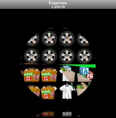
What? I think it’s trying to show auto, childcare, grocery, clothing, and travel expenses, but that’s just a guess based on the horrible, horrible graphic treatments. And the black background? The reflection? Why, why? (Click through to the screenshot for additional, gratuitous “CoverFlow” action.)
Somebody needs to buy these guys a copy of the Tufte canon.
Now, I know some people will place the blame on OS X for tempting developers with flashy built-in systems to make everything — even a simple chart — look slick. And those people would have more ammunition for their argument if they compared this new iBank release to, say, Quicken Online:
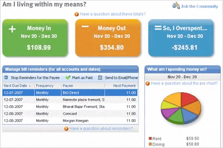
There’s a lot to love about this display: the simple money in/out/difference boxes, the Trivial Pursuit-style chart (though the perspective is unnecessary, what’s wrong with a flat view?) and overall the austerity is no doubt influenced by the comparatively limited functionality of a Web-based application.
Maybe the iBank crew should be confined to the Web until they learn that “useful” and “pretty” should go together…