If It Ain’t Broke…
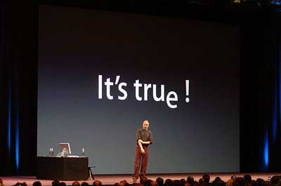
Seven months ago, Steve Jobs stood before an audience of Mac faithful (as he will today) and told them that Apple would be shifting its product line to Intel processors.
Well, actually, the slide told them:

By using Intel’s iconic “dropped ‘e'”, the slide cleverly gave the answer and referenced the question in just two words. It was a neat little move that took advantage of Intel’s massive brand recognition.
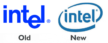
What a shame that this will no longer be possible, now that Intel has revamped their logo:

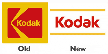
In doing so, they join the new AT&T as well as Kodak:

In both cases, I don’t think the original was any great achievement of graphic design (in fact, the original Intel logo is pretty ugly) but that’s hardly the point today. The Intel logo has been in use for 37 years, since Gordon “Moore’s Law” Moore first designed it. Similarly, Kodak has used a box of some form for around 70 years, with the traditional ‘K’ appearing in 1971.
Both of these marks are being replaced with logos that could charitably be called generic. Intel jumps on the swoosh bandwagon, working hard to look like every logo since 1999, and Kodak abandons the idea of graphic treatment altogether, opting instead for two plain lines to carry its traditional yellow-gold.
I have nothing against a freshened look (I certainly welcome Intel’s new website; the old one was awful) but I fear that these are actually examples where the people who work at these companies, staring at these logos day in and day out, got tired of them before the customers did. Then they cover their tracks by spouting wisdom such as this:
Intel’s new logo combines the essence of both of these powerful symbols [Intel Inside and dropped ‘e’], building on Intel’s rich heritage, yet also signaling the new direction the company is headed today. It also includes a new tagline: “Intel. Leap ahead™.†This tagline is Intel’s unique brand promise and is designed to communicate what drives Intel as a company, and what Intel makes possible.
So, from a standing start on “rich heritage”, the logo’s mighty curl signals a new direction for the company, setting up the leaping brand promise that Intel makes possible.
That’s one hell of a swoosh.
Here’s hoping that next time a big American company with an iconic logo wants to make a change, someone from Coca-Cola gives ’em a call to talk ’em off the ledge…

January 10th, 2006 at 8:59 am
I dont feel that a change in logo will be of much useful to any company. Indeed i guess it would be a big negative for them as the already existing has gained much public attention whether its good looking or not. The article seems good.
February 2nd, 2006 at 5:52 am
i dunno about anyone else, but to me the new intel logo looks a lot like… well about a million other logos. isn’t the idea to stand out from the rest?